7 days to go: book cover design
by isabelrogers
Continental Riff, the third book in my Stockwell Park Orchestra series, is published next Thursday 14thJanuary. The cover is again created by Clare Stacey at Head Design, who has done all the books in the series. I thought you might like to see how we arrived at them.
It was a wonderfully collaborative process between Clare, me, and my editor Abbie Headon. Abbie sent Clare a short outline of what the book was about – bearing in mind the cover was started before the book was completely finished, so some of this was conjecture because I am a defiant pantster when it comes to writing. (Planner vs. pantster is a whole other post but you get the idea.)
Clare tells me this is normal, as she often works with a lead time of up to a year. ‘The amount of info we receive varies wildly, from a vision the editor would like depicted on the cover, all the way to being sent the manuscript, so we can have a read and get a feel for the story ourselves. Most briefs run somewhere in the middle with an outline, as well as some important passages to the script. I’m lucky to work with two excellent colleagues at Head Design (big up Justinia and David!) who can be tagged in if the brief I’m working on needs a fresh set of eyes on it. We solely design book covers, which we all agree is pretty wonderful, as we are all very fond of reading books too.’
Clare came back with three totally different options to develop:

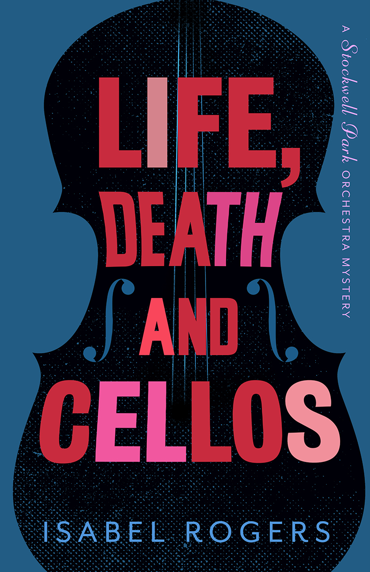

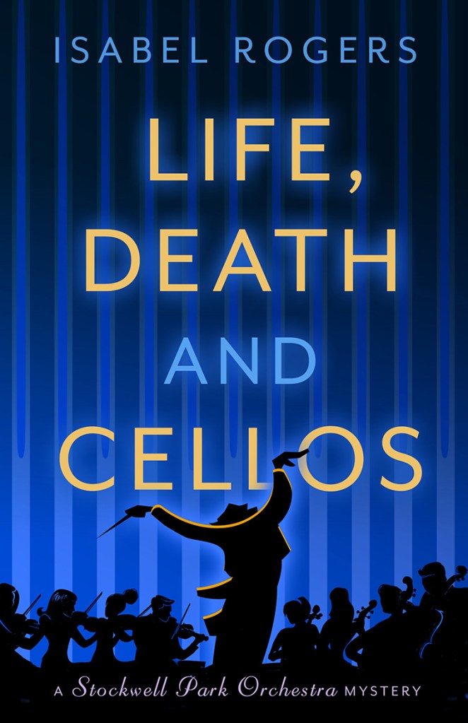
I was immediately taken with the blue one. Abbie admitted her first inclination was for the curly text one, but was ok with me having an allergic reaction to ‘girly curly’ letters and pastels. The cello shaped one was also great, but Abbie pointed out we might be limiting ourselves in future books if we started with the shape of a specific instrument.
We refined and simplified the image at the bottom of the cover, to fit the text about it being part of the Stockwell Park Orchestra series. As you see, our early thinking was to make the series a mystery one, but feedback from proofs said there wasn’t enough mystery to warrant that, so we went with the more general ‘series’ instead.
We switched the conductor to be right-handed (even left-handed conductors usually have to learn how to hold the baton in their right hand, which seems very unfair).
Clare again: ‘On an average job, one idea will be chosen to work on further, and then it’s a process of back and forth for a few more “rounds” until everybody is happy with the final cover. Needless to say, it doesn’t always work out this way. There have been one or two covers […] I’m talking in the region of 40+ visuals – and no, I’d better not name names!’

My favourite moment was when Abbie and I realised we had embedded an actual viola joke on the cover, by leaving them out altogether. We justified this by reasoning that if the view was to be an accurate front-of-orchestra one, then there are no violas on the outside edge facing an audience. So far no viola player has complained.

Once the strong image of Life, Death and Cellos had kicked off the series, Clare worked with those elements on the next cover for Bold as Brass. Still an eye-catching, full-saturation colour. Still the vertical lines I love, and the silhouettes of key characters to give a flavour of what was in the book. The physical size of Carl the trombonist looms nicely, and she caught the animosity between the two lots of school kids brilliantly.

And so to Continental Riff. Once I’d sneaked my title through (it was touch and go because the word ‘Continental’ needed to be downsized to fit across the book), we again went with the theme of strong colour, stripes and silhouettes. This time Clare had the great idea of slanting the lines to indicate movement, as the book is about the orchestra going on tour. We have a picture of Ingrid clutching her clipboard, and the toppling timpani. You’ll just have to read it to find out what’s going on.
Huge thanks to Clare Stacey for sharing her design knowledge. If you ever need a book cover, she’s your woman. When I asked her about her experience with my books, she replied:
‘I think of your Stockwell Park Orchestra series fondly for three reasons:
- It was my favourite sort of brief: illustrative and fun. And you were happy with the end result, always a bonus!
- I too found Abbie a really collaborative editor, who gave enthusiastic feedback all along the process, and lots of love to the whole book after it was all done. It was great to have you on board through the whole process – some authors don’t get a look-in until everyone else has signed it off.
- You invited me to your launch party. And you’d made cheese on sticks!’
Here’s to the time we can once again meet in person and enjoy retro snacks!
